Health & Fitness
The Graphical Evolution of Urban Planning
An exhibit in San Francisco has diagrams that depict the history of urban design, including key steps toward urbanism.
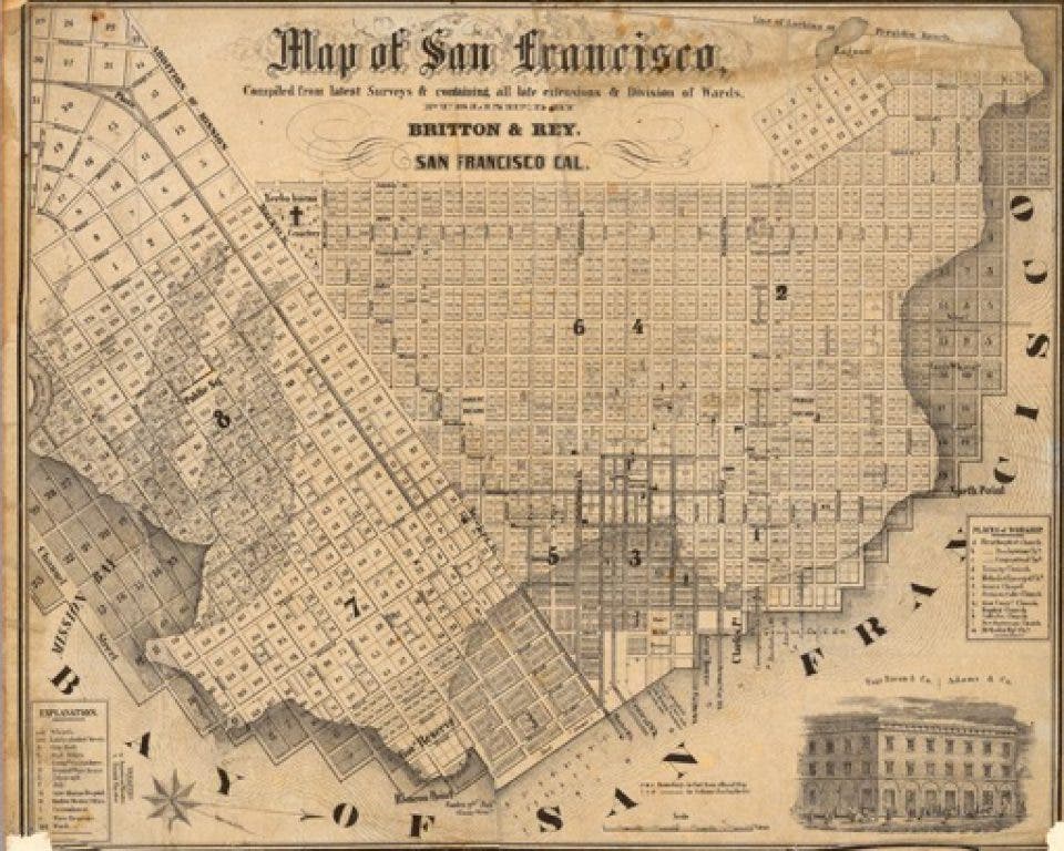
With holiday trips into San Francisco in the plans for many in the North Bay, this seemed an appropriate time to mention an ongoing exhibit at the Urban Center Gallery of the San Francisco Planning and Urban Research Association (SPUR). Curator Benjamin Grant has assembled maps, plans, renderings, and charts that depict key points of evolution in urban design.
Emily Badger in Atlantic Cities summarizes the key elements of exhibit, from a mid-18th century map of Rome through the visions of Ebenezer Howard and Le Corbusier that impacted so much of the U.S. experiment with drivable suburbia to the Mann hockey stick chart that put a spotlight on the threat of climate change.
John King in the San Francisco Chronicle takes a different perspective on the show, looking at the bigger picture of what the exhibits tell us about how cities emerge and evolve. King’s article effectively complements Badger’s.
Find out what's happening in Petalumawith free, real-time updates from Patch.
Perhaps it’s my civil engineering background, but my favorite comment about the exhibit is when Badger notes that graphics can "seductively oversimplify the problems of cities." Curator Grant concurs that "it can artificially simplify something that actually needs to be complex."
Exactly. I’ve seen too many designs that look great in plan view, but don’t result in an enjoyable experience for real people on the ground. I once worked in an office where the phrase "it’d look good from a balloon" was as shorthand for the same point.
Find out what's happening in Petalumawith free, real-time updates from Patch.
For anyone who visits the exhibit, look particularly at the Le Corbsusier plan and try to visualize actually imposing a real daily life onto his vision. Had more folks done so in the 1930s, we might have avoided some serious public housing missteps in the 1950s.
Also, having mentioned the Mann hockey stick chart, I know that some will focus on that element of the exhibit to the exclusion of all else. hich is a shame because that chart is only a small part of the story. Nonetheless, I’ll acknowledge that some of the statistical methodologies used by Mann and his collaborators in 1999 have been called into question. But that doesn’t mean that the general finding has been discredited. Indeed, the charts prepared since 1999 with the statistical methods rectified show much the same result.
It’s unlikely that my wife and I will find time to visit the exhibit during our holiday visit to the City next week, but I will go there in January. The exhibit will run through February 25. The SPUR offices are at 654 Mission Street.
As always, your questions or comments will be appreciated. Please comment below or email me. And thanks for reading. - Dave Alden (davealden53@comcast.net)
Dave Alden is a Registered Civil Engineer. He has worked on energy and land-use projects in California, Oregon, and Washington. He was also the president of a minor league baseball team for two seasons. He lives on the west side of Petaluma with his wife and three dogs. The blog that he writes can be found at http://northbaydesignkit.blogspot.com. He can also be followed on Facebook, LinkedIn, and Twitter.


